Mapping U.S. climate trends
Mapping U.S. climate trends
Our climate is changing and one of the most straightforward ways to understand these changes is by examining linear trends. In climate, to determine the linear trend we plot data values by when they occurred in the past and then determining a “best fit” line through that data. The slope of the line gives us the trend. Using this method we know that since 1895 the contiguous U.S. temperature has warmed at a rate of 1.45 °F per century.
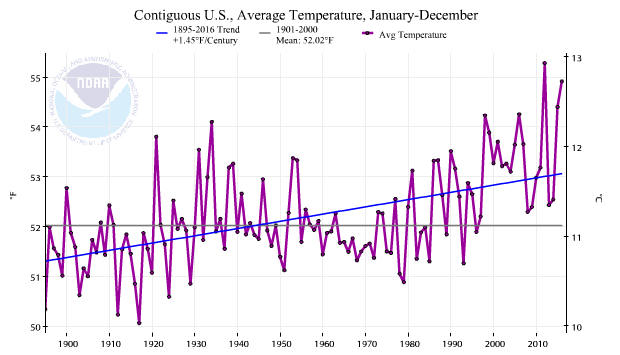
Annual average temperature for the contiguous United States from 1895-2016. Individual years are shown as black dots, connected by a purple line. The linear trend of 1.45°F per century over the period is represented by a straight blue line.
However, temperatures are not warming uniformly in space or time. The cold parts of the day (nights), cold parts of the year (winter), and cold parts of the world (high latitudes) tend to be warming the fastest. To help our users understand how different times and places are warming at different rates, NCEI has created trend maps for the contiguous U.S. of average temperature, minimum temperature (nighttime lows), maximum temperature (afternoon highs), and precipitation for the annual period and each month and season. The maps are created in a method similar to the linear trend analysis described above, but for each grid box in NCEI’s nClimgrid 5km gridded dataset. This Beyond the Data post will explore these new maps and explain some of the findings when we spatially examine trends across the Lower 48.
The curious case of February
In addition to creating trend maps for the different temperature and precipitation variables, we also produce trends maps for two different periods of record – the last 30 years (1987-2016) and the entire period of record (1895-2016). Depending on what a user might be interested in understanding, they might find utility in one or both of the time periods. For example, an electric power company might be interested in recent changes in temperature, while an ecologist trying to understand changes in migratory patterns might be more interested in the entire period of record.
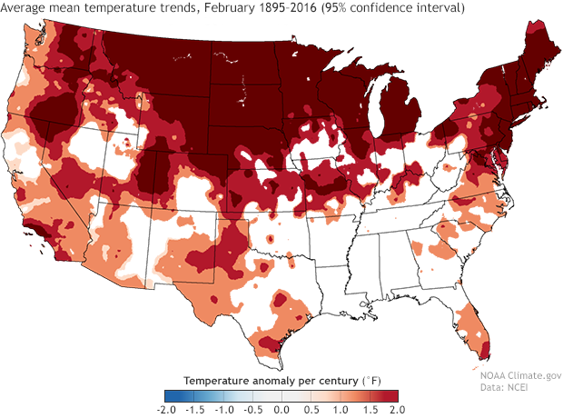
Click and drag the slider (center) to compare the two maps. (left) Change in February average temperature between 1895-2016. (right) Change in February average temperature between 1987-2016. Note that the range of values on the two maps are different.
Sometimes the trend for the entire period of record might be different than that of a shorter time period. That is the case when examining the February mean temperature trends. The trends over the entire period of record shows warming over much of the contiguous U.S. with temperature warming at a rate of at least 2.0 °F per century over the northern third of the nation. That pattern of warming is nearly non-existent when we examine just the most recent thirty years since 1987. A large chunk of the eastern U.S. has actually observed a cooling trend in temperatures with warming in New England and across much of the West.
Significantly Significant
This cooling trend in the 30-year data is due to warm Februarys in the early 1990s and several cold winters in the early 2010s, especially in the eastern United States. Outside of the cold years in the early 2010s, the temperatures in the eastern and middle part of the country were fairly warm compared to the 20th century average.This illustrates two important points to consider when looking at linear trends:
- If you just examined the most recent 30 years of data you wouldn’t get a complete picture of what is happening in the climate system.
- One weakness of using linear trends is that they are influenced, sometimes strongly, by values at the beginning and the end of the period of record, especially when applied to a relatively small number of data points.
We have added another set of maps to help users understand where trends in the data are statistically significant, or distinguishable from “no trend” with a high level of confidence. In some cases if you compute a linear trend from a completely random set of data, the mathematical calculation will still produce a value that implies and up or down trend. To help build confidence that a computed trend reflects an actual change in what we’re measuring (in our case, temperature), we can test the data to determine if a trend is actually significantly different from zero. Using a statistical tool known as significance testing, we are able to calculate with a 95% confidence if a trend that shows up in the data is real, and not just an artifact of the limitations of the math or observations. Depending on your field, you may be more familiar with this being expressed as "p <= 0.05."
Click and drag the slider (center) to compare the two maps. (left) Change in February average temperature between 1987-2016. (right) The locations where the calculated trends are statistically significant.
When we apply this significance testing to the 30-year trend on February mean temperatures, almost all of the trends disappear with the exception of cooling in small areas in southwest Georgia and central West Virginia. When the same significant testing is applied to the entire period of record trends, some of the smaller trends do disappear, but the warming over much of the nation, especially in the West and North do show up as statistically significant.
Statistically significant temperature trends (p=0.05) for the month of February, over the period 1895-2016.
The maxes and the mins
For the entire 123-year period of the contiguous U.S. minimum (“nighttime”) temperatures are warming at a faster rate compared to maximum (“daytime”) temperatures. To examine some of the spatial differences of trends in daytime and nighttime temperatures, let’s explore these trends during autumn (September-November) when nighttime temperatures have warmed at a rate of 1.43 °F per century while daytime temperatures have warmed at 0.89 °F per century.
The pattern of warming minimum temperatures and maximum temperatures is quite different when we examine the two maps. More than half of the nation has experienced warming minimum temperatures with the rate of warming exceeding 1 °F per century across large parts of the West and North. No warming trend, and even slight cooling, has been observed in parts of the Southwest and Southeast.
Click and drag the slider (center) to compare the two maps. (left) Change in average maximum ("day time high") temperature for September-November between 1895-2016. (right) Change in average minimum ("overnight low") temperature for September-November between 1895-2016.
When examining the maximum temperature trends we once again see that much of the West and northern tier have experienced warming, but a large part of the country from the Great Plains to interior Southeast have experienced cooling maximum temperatures. Trying to determine why there might be cooling maximum temperatures in the Southeast, the precipitation trends maps become extremely useful. While multiple factors are likely contributing to the cooling, locations from the Southern Plains, through the Southeast, and into the Northeast have experienced increasing precipitation. Increased precipitation is often associated with cooler maximum temperatures due to a decrease in incoming energy from the sun during the daytime.
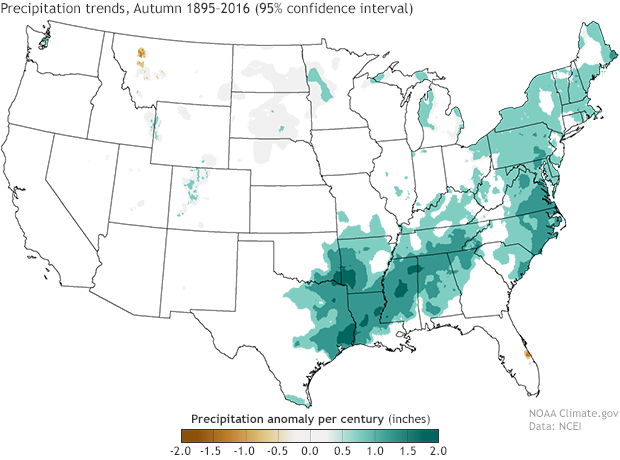
Statistically significant (95%) precipitation trends for autumn (September through November) for the contiguous United States, 1895-2016.
Conclusions
This blog post has discussed a couple of interesting patterns that emerge across the contiguous United States when plotting long-term trends of temperature and precipitation on a map. But there are countless things that the data presented in this way show us. Whether you are interested in how temperature and precipitation might be changing in your neck of the woods or you are interested in larger scale changes, exploring these new trend maps, in conjunction with the trend analysis available from our Climate at Glance tool, provide an easy way to examine the data yourself.