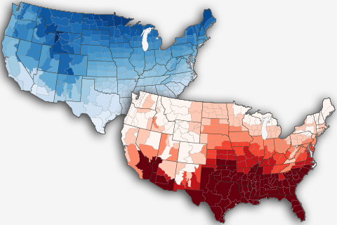
Average temperature maps can wash out days or weeks of hot and cold extremes that are important for things like energy planning and crop risk assessment. Jake Crouch explains how degree-day maps can bring back the details.
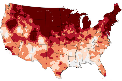
Our climate is changing. To help our users see how different times and places are warming at different rates, NCEI has created a new series of trend maps for the contiguous U.S. In this blog, NCEI's Jake Crouch gives us a show and tell featuring the new maps.
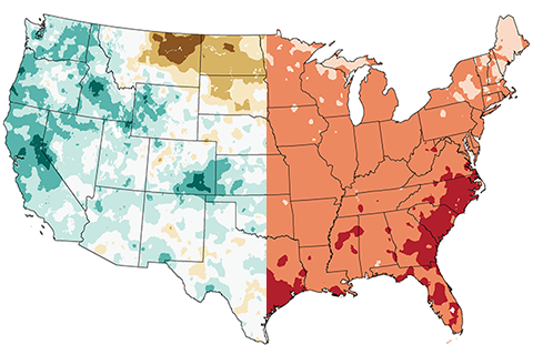
Normally, it's the dry years that are the hot ones in the United States. This year isn't playing by the rules.
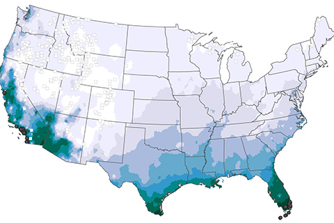
In mid-March, a cold air outbreak brought freezing temperatures to the Southeast devastating crops and causing over $1 billion in agricultural losses. For those of us who love fruit this is bad news. In this Beyond the Data post, we explain why it was so devastating even though freezing temperatures in mid-March aren’t that unusual for the Southeast.
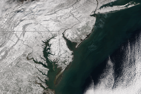
It might seem strange to be talking about snow cover during the heat of summer, but July 1st was “Snow New Year.” As most people do at the start of a new year, we’re reflecting on events from the past year to understand where we have been and where we might be going.
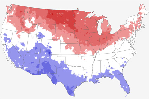
Is El Niño the Marcia Brady of climate variability? In this week's Beyond the Data blog, Jake Crouch talks about whether El Niño played a starring role in this winter's climate.
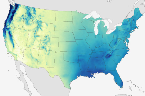
When it comes to what causes climate to vary over seemingly short distances, few things can compare to the influence of topography. This week in Beyond the Data, Jake Crouch talks about how climate scientists account for topography in interpreting climate patterns and trends.
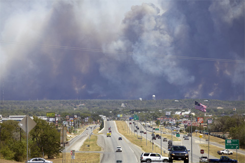
NCEI's Jake Crouch reflects on entering the field of climate monitoring during a historic drought in the Southern Plains.