Winter is coming: NOAA’s 2017-2018 Winter Outlook
If it’s October, it must be time for my annual blog post detailing NOAA’s forecast for the upcoming winter. And as always seems to be the case (well not in 2015), we’re still trying to figure out what will happen across the tropical Pacific. Here I look ahead to provide some insight as to what is most likely to occur during the upcoming winter with regards to both precipitation and temperature.
Standard reminder: probabilities are not certainties
Before discussing the outlooks, I do want to remind readers again that these forecasts are probabilities (% chance) for below, near, or above-average climate outcomes with the maps showing only the most likely outcome (1). Because the probabilities shown are less than 100% (of course), it means there is no guarantee you will see temperature or precipitation departures from normal that match the color on the map. As we’ve explained in earlier blog posts, even when one outcome is more likely than another, there is still always a chance that a less favored outcome will occur (witness precipitation during the last two winters in California).
Cut to the chase: What’s the outlook for this winter
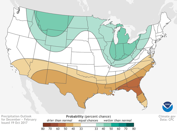
Places where the forecast odds favor a much drier than usual winter (brown colors) or much wetter than usual winter (blue-green), or where the probability of a dry winter, a wet winter, or a near-normal winter are all equal (white). The darker the color, the stronger the chance of that outcome (not the bigger the departure from average). Click image for version that includes Alaska and Hawaii. NOAA Climate.gov map, based on data from NOAA CPC.
Both the temperature and precipitation outlooks lean on typical La Niña impacts, particularly those of the past 30 years, and bear some resemblance to the outlooks issued for last winter (not surprisingly since the forecast guidance is similar – more on that below). In the image above, the winter precipitation outlook favors below-normal precipitation across the entire southern U. S., with probabilities greatest (exceeding 50%) along the eastern Gulf Coast to the coasts of northern Florida, Georgia, and southern South Carolina. In contrast, above-average precipitation is more likely across much of the northern parts of the country, in the northern Rockies, around the Great Lakes, in Hawaii, and western Alaska.
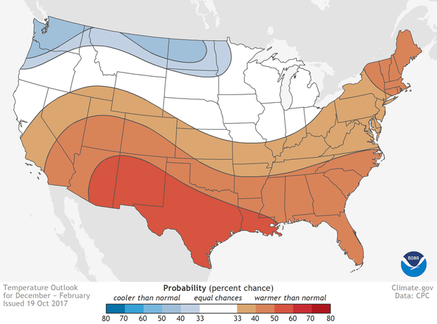
Places where the forecast odds favor a much colder than usual winter (blue colors) or much warmer than usual winter (red), or where the probability of a cold winter, a warm winter, or a near-normal winter are all equal (white). The darker the color, the stronger the chance of that outcome (not the bigger the departure from average). Click image for version that includes Alaska and Hawaii. NOAA Climate.gov map, based on data from NOAA CPC.
The temperature outlook shown above indicates above-average temperatures across the southern US, extending northward out West through the central Rockies and all the way up to Maine in the eastern part of the nation. Above-average temperatures are also favored in Hawaii and in western and northern Alaska. Chances are greatest in an area extending from the desert Southwest to central and southern Texas and Louisiana (greater than 50%).
Probabilities are tilted toward colder-than-normal temperatures along the northern tier from the Pacific Northwest to Minnesota and also in southeastern Alaska. However, the likelihood of below-average temperatures across the North is modest, with no probabilities in these regions reaching 50%.
Both maps include blank regions where neither above-, nor near-, nor below-normal is favored. These areas (shown in white and labeled EC for “equal chances”), have the same chance for above-, near-, or below-normal (33.33%). This doesn’t mean that near-average temperature or precipitation is expected this winter in those regions, but rather that there’s no tilt in the odds toward any of the three outcomes.
The NOAA Climate Prediction Center (CPC) issues probabilistic seasonal temperature and precipitation forecasts so users can understand risk and opportunities when making climate-sensitive decisions. However, keep in mind that these outlooks will primarily benefit those who have the wherewithal to play the long game. The maps show only the most likely outcome where there is greater confidence, but this is not the only possible outcome. As we’ve seen in recent California winters, even the less likely outcome sometimes does occur.
Déjà vu all over again?
Don’t worry if the preceding paragraphs seemed familiar. You’re not crazy. Regular readers may remember that last year at this time, we were also anticipating the emergence of La Niña later in the fall. Fast forward one year and, well, the situation doesn’t look much different. If La Niña were to develop this year, certain patterns of temperature and precipitation would be favored across the United States. Over the past few years, we’ve discussed the patterns preferred by El Niño and La Niña, and recently, Tom has presented figures showing what we’ve seen historically during all La Niña winters between 1950 and now (precipitation and temperature).
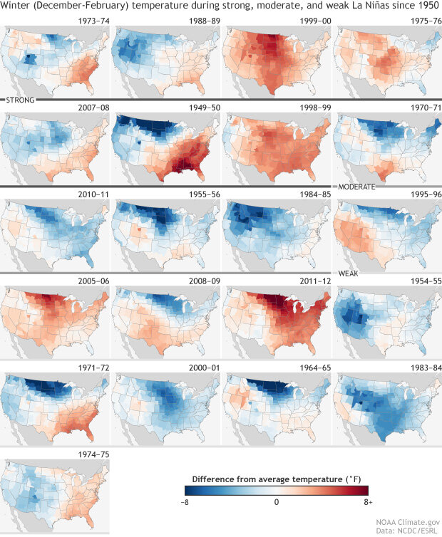
December-February temperatures compared to the 1981-2010 average during each La Niña winter since records began in 1950. Gray lines under the maps indicate event strength: strong (dark gray), moderate (medium gray), and weak (light gray). NOAA Climate.gov image based on climate division data from NOAA ESRL.
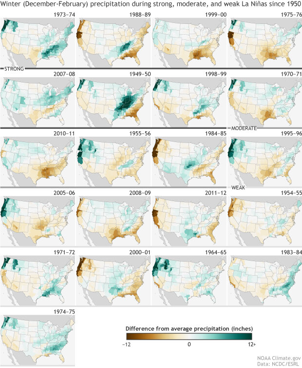
December-February precipitation compared to the 1981-2010 average during each La Niña winter since records began in 1950. Gray lines under the maps indicate event strength: strong (dark gray), moderate (medium gray), and weak (light gray). NOAA Climate.gov image based on climate division data from NOAA ESRL.
From these graphics, it’s easy to see that there’s been a fair amount of variability in the winter temperature and precipitation patterns during La Niña, but also that there are some clear tendencies for above or below normal temperature or precipitation in some regions.
Another way to examine the common features of La Niña winters is to create a composite map (an average of all of these individual maps). This will highlight those regions that often have temperature or precipitation anomalies of the same sign. For temperature, there’s a strong tendency for temperatures to be below average across some of the West and North, particularly in the Northern Plains, with a weaker signal for above-average temperatures in the Southeast, as shown in the image below.
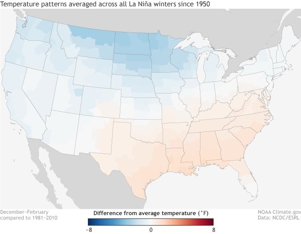
Winter temperature differences from average (1981-2010) in degrees F during La Niña winters dating back to 1950. Temperatures tend to be colder than average across the northern Plains and warmer than average across the southern tier of the United States. NOAA Climate.gov image using data from ESRL and NCEI.
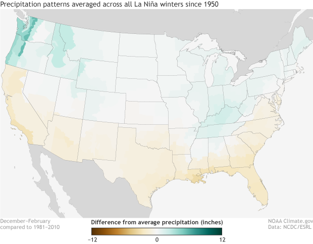
Winter precipitation differences from average (1981-2010) in inches during La Niña winters dating back to 1950. Precipitation tends to be below-average across the southern tier of the United States and wetter than average across the Pacific Northwest and Ohio Valley. NOAA Climate.gov image using data from ESRL and NCEI.
The precipitation pattern, presented above, shows negative anomalies (indicating below-normal rainfall) across the entire southern part of the country with a weaker signal of above-average precipitation in the Ohio Valley and in the Pacific Northwest and the northern Rockies.
However, these figures are based on about 20 different La Niña episodes, many of them from the 1950s, 1960s, and 1970s, and we have not removed the longer-term trends from the temperature and precipitation data used here. As Tom pointed out last month, the trend is an important component of seasonal temperature forecasts. It’s fairly trivial to break the sample size in half, and compare the temperature patterns for the older half to the more recent half. That provides a significantly different picture, with the average of the latest events much warmer than the earlier ones. We can see this by comparing the right image below (more recent events) with the one to the left of it (older events).
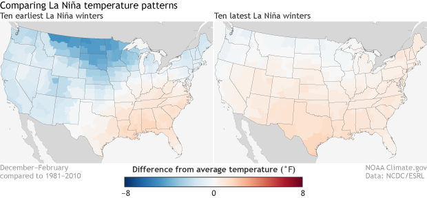
Comparison of winter temperature differences from average (1981-2010) in degrees F between the earliest and most recent ten La Niña winters dating back to 1950. Temperatures tend to be warmer across much of the country during the most recent ten La Niña events as compared to the earliest ten La Niña events . NOAA Climate.gov image using data from ESRL and NCEI.
This picture is consistent with long term warming trends over the United States. These historical relationships along with guidance provided by a suite of computer models plays a strong role in the final outlooks. Differences between the two periods for the precipitation composites are much smaller and therefore are not shown here.
Lead editor: Nat Johnson
Footnotes
(1) The terciles, technically, are the 33.33 and 66.67 percentile positions in the distribution. In other words, they are the boundaries between the lower and middle thirds of the distribution, and between the middle and upper thirds. These two boundaries define three categories: below-normal, near-normal and above-normal. In the maps, the CPC forecasts show the probability of the favored category only when there is a favored category; otherwise, they show EC (“equal chances”). Often, the near-normal category remains at 33.33%, and the category opposite the favored one is below 33.33% by the same amount that the favored category is above 33.33%. When the probability of the favored category becomes very large, such as 70% (which is very rare), the above rule for assigning the probabilities for the two non-favored categories becomes different.
Comments
Figure
RE: Figure
Yep, you're right. It should be "difference from normal precip" in inches. We will get that updated first thing tomorrow.
Appreciation!
NAO
RE: NAO
Thanks for the comment. The NAO is much harder to forecast this far in advance as compared to things like ENSO. However, we know that the sign of the NAO can mean the prevalence of certain patterns across the United States. In fact, an earlier ENSO blog post talked about what the phases of NAO mean for the United States. I am sure forecasters will be looking at forecasts of the NAO as we get closer to winter to see what type of influence it may have.
RE: RE: NAO
La Nina temperatues
RE: La Nina temperatues
The earliest 10 La Nina winters were determined by taking the first 10 cases where the DJF values on this chart were blue marking a La Nina event. The most recent 10 La Nina winters were determined by taking the last 10 cases on the same chart.
Laughable predictions
RE: Laughable predictions
Hi Hal, we've been trying to avoid using too much "technical mumbo jumbo" in our explanations as we know scientific jargon can be too dense. If you are actually curious about how our probabilistic forecasts perform, we provide two sites where you can look at the numbers: one and two. And if you'd like an explainer on how to properly verify our forecasts to see if they truly are accurate or not, I wrote a three part series on just that topic. Part one, part two and part three.
RE: RE: Laughable predictions
RE: Laughable predictions
RE: Laughable predictions
Probabilities
RE: Probabilities
Hi Lisa, I am sure there are research papers being written as we speak about the winter rains across the west coast last year.
As a note, last year's winter outlook had a slight tilt towards wetter conditions for much of Washington but Oregon and much of California had an equal chance for above, normal or below-average rainfall (southern California had a slight tilt towards drier than average). An equal chance forecast isn't necessarily an incredibly far off prediction. It's just an acknowledgment that sometimes signals for winter precipitation are conflicting or difficult to determine months in advance.
CLIMATE CHANGE
Winter Outlook
Active hurricane season
RE: Active hurricane season
Hi Alex,
The hurricane pattern in the Atlantic was certainly active this year! However, while ENSO affects hurricanes, hurricanes don't affect ENSO. Sort of like how allergy season affects sneezes, but sneezes don't affect allergy season--ENSO changes the background state in which hurricanes form.
Great information here
RE: Great information here
Winter 2017-2018
Unnatural Changes in Precipitation at Some State Boundaries
RE: Unnatural Changes in Precipitation at Some State Boundaries
Hi James,
Yes, your observations are spot on! There are some transitions and gradients in some of the maps that are not physically realistic. The reason is that these maps are based on data that are averaged within the U.S. Climate Divisions: https://www.ncdc.noaa.gov/monitoring-references/maps/us-climate-divisio…. As you can see, there are large variations in the sizes of these climate divisions. In regions where you have two neighboring climate divisions covering a large area, it's possible for the average precipitation to be quite distinct between the two divisions. This would lead to unnaturally sharp contrasts in the maps you mention. If the maps instead were based on data averaged in small, regularly spaced grids, then we would expect the contrasts to be more smoothly varying.
NYC Winter 2017-18
Info
New England impact
RE: New England impact
Hi CJ,
You're right that in the average of all La Nina winters since 1950, there is a very slight tendency for below average temperatures in New England. However, one of the figures above shows that the tendency is reversed in the last 10 La Nina winters, indicating that the long-term warming trend is counteracting that slight tendency for cooler temperatures in New England. The forecast models of the North American Multi-Model Ensemble (NMME) (http://www.cpc.ncep.noaa.gov/products/NMME/seasanom.shtml) also have been fairly consistent in forecasting a tendency for warmer than average across the entire eastern U.S., so they seem to be honing in on this La Nina + trend signal. Because no two El Nino or La Nina episodes are the same, it's also possible that there are particular features of this forecast event that may lead to deviations from the classic La Nina signal, but it is difficult to tease out exactly what those features may be without additional study.
The precipitation signal over New England is quite weak, and NOAA's Winter Outlook reflects this. That doesn't mean New England won't see a wet (or dry) winter - either option certainly is possible! New England is impacted by other important large-scale climate patterns such as the North Atlantic Oscillation (NAO), but those patterns are much more difficult to predict more than a couple weeks in advance.
Forecast?
RE: Forecast?
Well, we can't call it yet, winter's not over! These forecasts are for the winter average, which means December-February. And in fact, December's average temperature in Florida was 61.9°F, which is 3.1 degrees Fahrenheit warmer than the 1981-2010 average. We won't know for another ~6 weeks whether the recent weeks of very cold temperatures will be enough to cancel out December's warmth, not to mention what might happen in February. The latest monthly outlook still favors (though not super strongly) much warmer than average temperatures across the South in February. [[{"fid":"34508","view_mode":"default","fields":{"format":"default","field_file_image_alt_text[und][0][value]":false,"field_file_image_title_text[und][0][value]":false,"field_caption[und][0][value]":"","field_caption[und][0][format]":"full_html"},"type":"media","field_deltas":{"1":{"format":"default","field_file_image_alt_text[und][0][value]":false,"field_file_image_title_text[und][0][value]":false,"field_caption[und][0][value]":"","field_caption[und][0][format]":"full_html"}},"link_text":null,"attributes":{"class":"media-element file-default","data-delta":"1"}}]]
So as far as whether this winter's seasonal outlook was a bust for Florida or anywhere else, we still have to wait and see.
wx extremes
RE: wx extremes
This post is on our older winter outlook from last year. Check back with the blog in mid-late October for our article about winter 2018-19!
Comments have been disabled on this article