February 2021 ENSO update: library time
La Niña is still here, but forecasters estimate about a 60% chance that neutral conditions will return this spring. By the fall, the chance that La Niña will return is approximately equal to the chance that it will not. Let’s take a stroll around ENSO’s eclectic bookshelf and see what we can learn
Romance novels
The temperature of the ocean surface in the Niño 3.4 region of the tropical Pacific, our primary El Niño/Southern Oscillation (ENSO) measurement, was just about 1.0°C (1.9°F) below the long-term average in January, according to the ERSSTv5 dataset. As of this month, the long-term average is calculated over 1991–2020. (More on this page-turner later!)
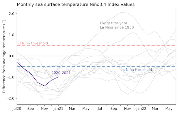
Monthly sea surface temperature in the Niño 3.4 region of the tropical Pacific for 2020-21 (purple line) and all other years starting from first-year La Niña winters since 1950. Climate.gov graph based on ERSSTv5 temperature data.
Of course, ENSO wouldn’t be ENSO without the coupling between the ocean and the atmosphere. In January, La Niña’s expected relationship—cooler-than-average ocean surface and a stronger-than-average Walker circulation—was clearly going hot and heavy. Evidence of this was provided by more rain and clouds over Indonesia and less over the central Pacific, stronger west-to-east winds aloft, and stronger east-to-west winds near the surface of the equatorial Pacific.
Speculative futurism
Although comfortably exceeding the La Niña threshold of more than 0.5°C cooler than average, the January Niño 3.4 index moved closer to average from December, as you can see in the graph above. Forecasters think this tendency will continue, and they estimate there’s about a 60% chance the index will move into neutral territory by April–June. The next most likely scenario—the remaining 40%—is a continuation of La Niña through the spring.
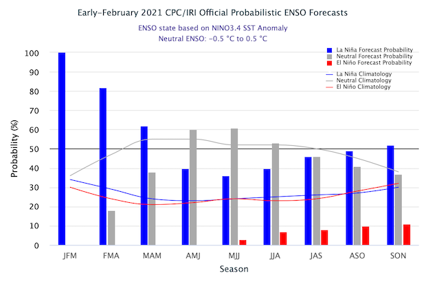
The official CPC/IRI ENSO probability forecast, based on a consensus of CPC and IRI forecasters. It is updated during the first half of the month, in association with the official CPC/IRI ENSO Diagnostic Discussion. It is based on observational and predictive information from early in the month and from the previous month. Image from IRI.
What happens next fall is less clear. There is a wide range of possible outcomes shown by the computer model forecasts, but we’re getting in to the spring predictability barrier, a time of year when model forecasts are less reliable. By the fall, chances of La Niña are about 50%, with approximately 40% chance of neutral and 10% chance of El Niño.
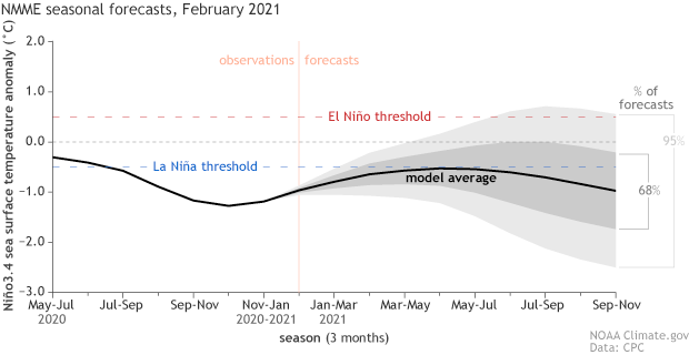
Climate model forecasts for the Niño3.4 Index. Dynamical model data (black line) from the North American Multi-Model Ensemble (NMME): darker gray envelope shows the range of 68% of all model forecasts; lighter gray shows the range of 95% of all model forecasts. NOAA Climate.gov image from University of Miami data.
Historical investigation
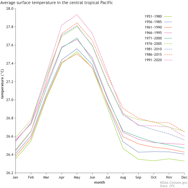
For the past five years, our “long-term average” in the ENSO world has been defined as the average over the 30-year period 1986-2015. Many weather and climate organizations, including NOAA, use a 30-year period to define “average” or “normal” conditions, also known as climatology, in accordance with the World Meteorological Organization (WMO). Most organizations update their 30-year climatology once per decade—again, including NOAA—so now they are turning the page from 1981–2010 to 1991–2020. ENSO is a bit special—I’ll get to that in a minute.
Defining average conditions is helpful for a couple of reasons. First, it provides useful information about local climate, such as “the average January high temperature in Baltimore is 41°F.” Also, knowing the average helps us to place current events in a historical perspective, and to quickly understand patterns. For example, if we were to just say “February in Minnesota was cold,” it wouldn’t tell us much, because February is always cold in Minnesota! But saying it was “colder than average” is more informative.
This 30-year convention dates to the early 20th century. Why 30 years? To quote the WMO’s Guidelines on the Calculation of Climate Normals, 2017 edition, “The 30-year period of reference was set as a standard mainly because only 30 years of data were available for summarization when the recommendation was first made.” That may seem a bit arbitrary, but also, it seems to me that 30 years happens to be a reasonable memory span for an adult, making it a little easier to understand “colder than average” and so on. At any rate, 30-year normals are deeply ingrained in weather and climate science now.
Contemporary thriller
El Niño and La Niña are defined as above- and below-average tropical Pacific sea surfaces, respectively. Because the tropical Pacific is warming along with the rest of the planet, ENSO researchers realized that if they continued to use the previous three-decade average to define ENSO events, it might look like El Niño was happening more often than it really was, and La Niña could appear scarcer than it should be. They decided it would be a better picture of reality if the 30-year climatology was updated every five years.
Thirty-year average periods that NOAA is using to calculate the relative strength of historic El Niño and La Niña events. Climate.gov figure from ERSSTv5 data, based on CPC original.
Historical ENSO events are evaluated based on centered 30-year averages. For example, the individual years in 1986–1990 are compared to the 30-year average 1971–2000, and the years in 1991–1995 are compared to 1976–2005. Check out this climate.gov article, written by our illustrious editor, Rebecca Lindsey, for more details on this “rolling” climatology approach.
Since we don’t know how the next 15 years will turn out (our jobs would certainly be quite easy if we did!), more recent years in the record are compared to the latest 30-year period. This means that, up until now, 2001–2020 were compared to the 1986–2015 climatology. As of this month, those years starting in 2006 are now compared to 1991–2020.
This has had the effect of slightly changing the historical ENSO event table. One effect is that the winter of 2019–2020, which featured above-normal Niño 3.4 index values, is no longer colored red—indicating an El Niño event—in the table. At the time, forecasters thought that these warmer Niño 3.4 index values were more likely due to temperature trends than to El Niño, especially since there was no consistent atmospheric response, and this has been borne out.
Epic saga
I could go on about the implications of trends and ENSO for many pages, but I’m running out of column inches here! Thanks for sticking around through another chapter in our serial ENSO novel.
Comments
La Nina Historically Has Meant Record Hottest Summers in Texas
Excellent Article
Add new comment