Tools & Interactives
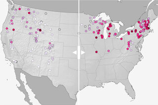
Compare projected changes in downhill ski season length by 2050 if we follow a moderate versus a high pathway of carbon emissions.
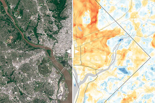
View this toolHeat maps and matching satellite images presented with a slider, so that readers can get a sense of how and why each city experiences such a wide range of temperatures on a hot summer day.
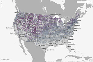
View this toolThis interactive map shows the latest day for which snow greater than 0.1 inches was recorded for thousands of U.S. weather stations during their period of operation (up through April 11 of 2018).
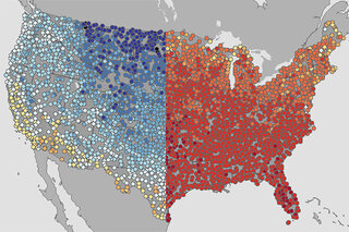
View this toolTo highlight spring’s extremes, here are maps of the warmest and coolest first day of spring (March 19) recorded at thousands of U.S. weather stations during each station’s history.
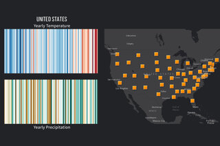
View this toolThis Storymap provides access to a collection of "stripes" graphics, in which a location's yearly temperature and precipitation conditions since 1895 are shown as a simple row of colored stripes without dates or numbers.
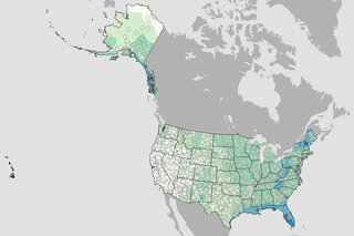
View this toolWhat are the chances of rain on the Fourth of July? This map shows the historic probability of there being of at least 0.1 inch of rain on the July 4 based on the latest U.S. Climate Normals from NOAA NCEI.
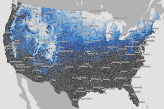
View this toolMap of the historic probability of there being at least 1 inch of snow on the ground in the Lower 48 states on December 25 based on the latest U.S. Climate Normals from NOAA NCEI.
View this toolBrowse stories about the ‘climate behind the weather’ in this interactive map of current events found in our News and Features department.
View this tool