Alaskan North Slope climate change just outran one of our tools to measure it
It was bound to happen. In fact, my colleagues have planned for this. More on that later.
On December 4th, the folks in the Climate Monitoring group at the National Centers for Environmental Information (NCEI) did what we do pretty much every 4th of the month: we processed the previous month's data to prepare our initial US climate report. The data from Utqiaġvik, Alaska, was missing, which was odd. It was also missing for all of 2017 and the last few months of 2016. This was even weirder, because we knew we’d kinda marveled at how insanely warm the station had been for several weeks and months during 2017.
What happened?
The short version: in an ironic exclamation point to swift regional climate change in and near the Arctic, the average temperature observed at the weather station at Utqiaġvik has now changed so rapidly that it triggered an algorithm designed to detect artificial changes in a station’s instrumentation or environment and disqualified itself from the NCEI Alaskan temperature analysis, leaving northern Alaska analyzed a little cooler than it really was.
How did that happen? Why is it important? What are the impacts?
We’ll hit some of these questions in this edition of Beyond the Data.
First, where is Utqiaġvik?
Utqiaġvik (it's pronounced something like OOT-ki-aag'-vik) sits within eyesight of Point Barrow, the northernmost point in America, on the Arctic Coast of northern Alaska. Now recognized by its Iñupiat place name, it is still commonly known as “Barrow.” My fellow Oklahomans will recognize Barrow as the place where Will Rogers and Wiley Post perished in a plane crash in 1935. (Full disclosure: Will’s my personal hero and perpetual “person living or dead I’d want to have dinner with”).
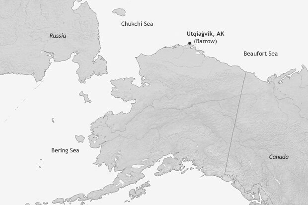
Point Barrow is the northernmost point in the United States. The town of Utqiaġvik, also referred to as Barrow, is one of the few locations in the northern part of the state with a relatively long temperature record. NOAA Climate.gov map.
In the context of a changing climate, the Arctic is changing more rapidly than the rest of the planet. This is true for temperature and in ways unfamiliar to most of us down here in the Lower 48: permafrost thawing, changes in sea ice cover, the “shrubification” of tundra.
Utqiaġvik, as one of a precious few fairly long-term observing sites in the American Arctic, is often referenced as an embodiment of rapid Arctic change. The many facets of its changing climate have been detailed here on climate.gov. Beyond the Data touched on it a few months ago. Heck, you can search this site for “Barrow” and you’ll have enough reading material for hours (go on, search for it).
Some of the many changes happening in and around Utqiaġvik involve sea ice, when it arrives near the Arctic coast, how long it stays, when it recedes. October and November are months during which Arctic sea ice, having contracted to its smallest footprint each September, advances towards Alaska’s Arctic (northern) coast. In recent years, that arrival has been slower and less complete.
Here’s a look at the relationship between that, and the temperature at Utqiaġvik. The graphic just below shows two sets of data for each November since 1979. While you peruse it, please let me thank my NOAA colleagues Jake Crouch, who sits ten feet from me, and Rick Thoman, who sits about 3,500 miles from me in Fairbanks, for being the brains/inspirations for these next few graphics.
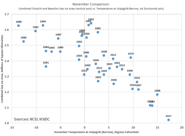
Sea ice area for the combined Chukchi and Beaufort basins of the Arctic Ocean (vertical axis) plotted against average temperature at Utqiaġvik (Barrow), Alaska for each November from 1979-2017. Sea ice area courtesy National Snow & Ice Data Center. Utqiaġvik temperature from NWS/NCEI.
On the vertical axis, the combined November sea ice area for the Chukchi and Beaufort Seas, the two sub-basins of the Arctic Ocean that touch Alaska’s Arctic (northern) coast. Higher on the scale means more sea ice in the combined basin.
On the horizontal, the November temperature at Utqiaġvik. Farther right means warmer.
The pattern is striking, showing a clear relationship. For Novembers with low sea ice in the basins (the recent years), the temperature, fairly reliably, is high (R=-0.77 if you're scoring at home). November 2017 is the rightmost (warmest) and bottommost (smallest sea ice area) of the group.
The basics are this: when sea ice in the region is small, more (relatively warm) Arctic water is exposed to the atmosphere, which means much warmer air temperatures in the region, all else being equal.
It’s not just November that’s changing at Utqiaġvik. This next graphic shows each month’s average temperature for two mini-eras, 1979-99 and 2000-17. I chose 1979 as a starting point because that’s when satellite-based sea ice area data begins in earnest. I broke the 39-year satellite era roughly in half, into its 20th century and 21st century segments.

Average temperature at Utqiaġvik (Barrow), Alaska for each of the 12 calendar months, for two "mini-eras" since the dawn of satellite observations of sea ice in the area. Brown circles represent the average temperature during 1979-99 (late 20th century). Gold triangles represent those for 2000-17 (21st century to date). For comparison, the average increase between the two mini-eras is 1.9°F for the first nine months of the calendar. For October, it is 7.8°F. For November, 6.9°F. For December, 4.7°F.
The first nine months of the year have warmed across those segments by 1.9°F. That’s almost twice the contiguous U.S. increase for the same same nine months and the same two mini-eras. But look at the increases in October, November and December. 21st century October at Utqiaġvik is a whopping 7.8°F warmer than late 20th century October.
Add it all up, and thanks largely to these three months, even the annual temperature at Utqiaġvik has changed dramatically in the last two decades.
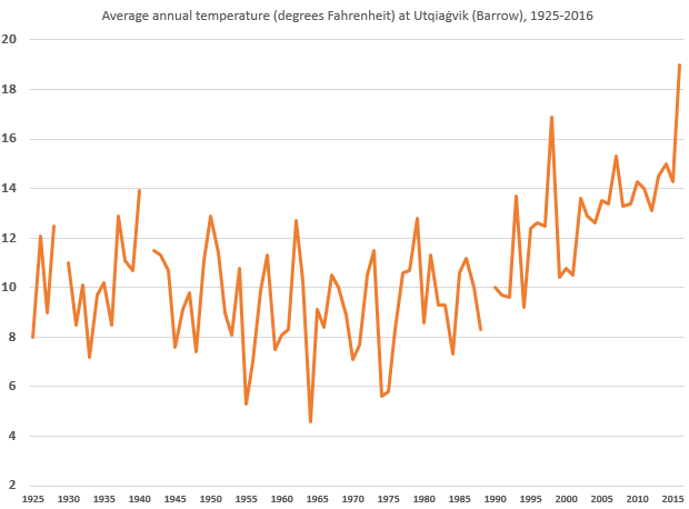
Average annual temperature in Fahrenheit at Utqiaġvik (Barrow), Alaska, from 1925 through 2016. The annual values for 1929, 1941 and 1989 are not plotted because of some missing data during those years.
So what does this have to do with dropping the data?
Many things can affect a long-term temperature record at a place. In a perfect world, all of those things are related to the actual temperature. Thankfully, for the most part, they are. But things can happen to artificially affect a long-term temperature record. Sensors can change, the types of shelters that house those instruments can change, the time of day that people (many of them volunteers) make observations can change, stations get moved to a warmer or cooler place nearby. You get the idea.
Networks of weather stations are designed to measure stuff for weather forecasters. They run non-stop, and spit out a lot of data. It's awesome. Unfortunately for climate trackers, networks built for informing weather pros don't necessarily take care of all the things needed to track climate.
Where a convenient move to the other end of the runway to a place that's half a degree cooler shouldn't really impact a weather forecast model from day to day, that can look a lot like climate change in the long term. So those kind of details need to be tracked in a best-case scenario, and detected when they slip through the cracks.
It would be great if we just had 4000+ weather station gnomes whose families are bound to tend a given station’s climate record for generations, who knew every detail of a station’s quirks, and who always write down all the station’s data including margin notes like "moved down the runway, built a shed nearby, and swapped out the sensor" - then hand carry their notebooks to NCEI each month. But instead, data ingest is an automated process, which means the handwritten margin notes sometimes get overlooked. So we need an automated process that flags problems and tells scientists, “hey, check out Barrow, there’s something odd there.”
Some of my colleagues at NCEI - namely Matt Menne and Claude Williams of Menne et al. and Williams et al. fame - have been at the vanguard of developing algorithms and approaches to detect and flag these types of changes, so that the true climate signal can shine through some of these challenges. One suite of those tests is called the “pairwise homogeneity algorithm” but let's just call it the “PHA test” from here on.
Stations behaving badly
The PHA test is not mathematically simple, but the concept is straightforward. When climate changes—naturally or from global warming—most of the stations in the same region should change in a similar way.
The PHA test's basic job is to detect when a station's relationship to its neighbors changes - over the long term. It does this by pairing different combinations of stations in a region and looking at how the temperatures at each station co-evolve consistently over time. In other words, it checks if a station's temperature over the long term is changing in ways that are different from nearby stations and inconsistent with its past behavior.
This change in behavior typically indicates some kind of "artificial" change like those mentioned above. For example, if a station is moved from a higher (cooler) elevation down to a lower (warmer) one, over the long term, that will show up as the station tracking warmer, relatively speaking, relative to its neighbors. The computer programs running the PHA test flag stations that jump to a new (relative) state like this.
What happens to stations behaving badly
Here are some important things to note:
- the test is quite conservative: it takes considerable evidence for it to “make the call,”
- the algorithm running the test, like many things in data science, is hungry for more data points. Generally speaking the more neighboring stations, the better and more confident the algorithm is,
- when there is enough information from neighboring stations to build high confidence, the station record is adjusted. If not, an estimate is made, and the data are flagged as an estimate,
- NCEI does not use estimated data in its US temperature analysis. Data flagged as such are considered not to exist,
- the raw observations are preserved for perpetuity. Each station carries two histories: an adjusted set that corrects for the issues detailed above, and an unadjusted set that is never altered from its original observation.
You can see where I’m going here, right?
As a relatively isolated station, experiencing profound and unique change, Utqiaġvik was destined to get flagged. And it happened this month. Having built confidence that a disruption to the station was afoot, the PHA test retroactively flagged the last 16 months and removed them from the monthly analysis. But in this case, instead of a station move, or urban sprawl, or an equipment change, it was actually very real climate change that changed the environment, by erasing a lot of the sea ice that used to hang out nearby.
The silver lining
Climate change is challenging. So is measuring it. But it's important to measure it, and better data sets mean better and more confident measurements. We will be able to restore Utqiaġvik in coming months, but we tread slowly and conservatively, so it won't pop back in our US and Global analyses right away.
On a longer time horizon, those same folks that designed the PHA test are constantly working to improve it. The next version of the Global Historical Climatology Network (GHCN-Monthly), upon which the monthly temperature analyses are based, is coming in early 2018*. You know what’s already built into that version? A certain latitude (65°N, currently), poleward of which the PHA test becomes even more forgiving, considering the rapid Arctic changes, and the station scarcity in the region.
That’s a posture of continuous improvement, and it’s just one way that even old stalwart datasets like GHCN-Monthly get better over time, thanks to a few of my colleagues that work Beyond the Data.
*[CORRECTION: This date was originally mistyped as 2019.]
Comments
Barrow Wx station
PHA test
RE: PHA test
Great question, Jim. As you probably suspect, the answer is complicated. One challenge with that is that some "threats to validity" in the observing environment (encroachment of urban areas being a great example) will manifest as something that looks a lot like linear trends! I'll ask the pros to see if they've considered that and get back to you.
Thanks for this article.
Thank you
RE: Thank you
Thank you Jack for taking the time to write this note. I really appreciate it.
Deke
Outliers and the Reason for them
RE: Outliers and the Reason for them
Hi there, thanks for the kind notes.
In operations, the algorithms do not attempt to distinguish between any of these or definitely name a problem. This prevents the creep of (well-intentioned) overly prescriptive fixes. It instead points out when the data are indicating an issue, and in which direction the data suggest things are going off course, and a suggested fix.
With that said, the "usual suspects" are:
Each of these types of scenarios was used in a "blind test" for the algorithms - blind to the algorithms and even blind to the creators of the algorithms! - to see if the algorithms were capturing the types of changes seen, and correcting in the right direction, while minimizing harm done to "innocent" observations. The results were quite positive. While no test is perfect, the algorithms were generally correcting the signal in the proper direction.
If you're a QC geek (and it sounds like you might be!) the tests and the results are here: http://onlinelibrary.wiley.com/doi/10.1029/2011JD016761/abstract
Deke
Wanting More Data
RE: Wanting More Data
Hello and thanks. That's kind of the point of this article: that a localized (relative to the observing network, anyway) phenomenon over a short time (a couple of decades) caused such a change that it appeared to be artificial. It wasn't.
Deke
Which station?
RE: Which station?
Hi there, I'm not sure which comment you're referring to?
With that said, yes, the data are from the airport: https://www.ncdc.noaa.gov/homr/#ncdcstnid=20022476&tab=MSHR
Deke
RE: RE: Which station?
RE: RE: RE: Which station?
The data are part of the GHCN-Monthly v3 data set.
https://www.ncdc.noaa.gov/ghcnm/v3.php
Deke
RE: RE: Which station?
Other Arctic Stations
RE: Other Arctic Stations
Kuparuk, Nuiqsut, Colville Village (near Nuiqsut, but on the coast) were all included.
UHI?
RE: UHI?
Hi there,
The local impacts of urbanization or similar land use change is one of several factors considered in the design of the algorithm, in that it is one of the local changes that can cause the algorithm to bite. Operationally, the algorithm doesn't try to distinguish between factors.
Deke
RE: RE: UHI?
RE: RE: RE: UHI?
Hi there, as with all PHA "hits" the original data are retained and saved for perpetuity. The unadjusted data are the ultimate foundation for all of our analysis products. Each month, we start with the unadjusted ("raw") data. The values that are flagged are either held out of the assessment (as in the case for Barrow), or are adjusted to correct for the perceived issue (the algorithm needs much longer segments to build enough confidence to make the adjustment).
Again, to re-emphasize: the unadjusted data are preserved and we use this as the foundational set for subsequent analyses.
Not only are they preserved, but they are publicly available at https://www1.ncdc.noaa.gov/pub/data/ghcn/v3/ In that directory the latest average temperature at each station ("tavg") is available in raw, unadjusted form and the adjusted dataset indicators
Thanks!
Deke
RE: RE: RE: RE: UHI?
RE: RE: RE: RE: RE: UHI?
For any given month's report:
In any event, the raw data are preserved from month to month, and are the foundation for analyses in future months.
Deke
RE: RE: RE: RE: RE: RE: UHI?
RE: RE: RE: RE: RE: RE: RE: UHI?
Yes.
Question: Can satellite imaging warm the earth?
RE: Question: Can satellite imaging warm the earth?
No. Many of the instruments are "passive" - meaning they don't emit any energy Earthward; they only "listen" or "take pictures". "Active" sensors will emit a signal and wait to record the characteristics of its "echo." The amounts of energy involved in active sensors are miniscule compared to the factors that determine temperature on the Earth - namely the Sun's energy, and the ways that the atmosphere and ocean systems transport it around.
Deke
RE: RE: Question: Can satellite imaging warm the earth?
RE: RE: RE: Question: Can satellite imaging warm the earth?
I am comfortable asserting that the retreat of sea ice is the dominant cause of the autumn differences in the mean (not necessarily for every given year). It is both a very real local change affecting the locality and one of several Arctic feedbacks that are generally accelerating warming in the region. There is rich detail in NOAA's 2017 Arctic Report Card on the interplay between sea ice and air temperature.
The CRN is a wonderful network and was designed and deployed to help provide a baseline for situations just like these. However, the nearby CRN station did not exist in the "before" years in this comparison; it would not provide the before-and-after context needed to compare.
Thanks for your questions. I'm going to close out this thread now and devote some attention to other NCEI customers. Thanks!
Deke
Clarification Question
RE: Clarification Question
Thanks, I very much appreciate the comment. Yes, it's the former scenario, as you are leaning toward: the retreat of sea ice warmed the area and the instrumentation correctly observed that warming.
Deke
RE: RE: Clarification Question
RE: RE: RE: Clarification Question
Hi Chris,
There is always the possibility that the PHA algorithm can get "fooled." Having more dense data (in space and time) would help, and probably help a lot, but it would not eliminate or make this aspect of the PHA infallible.
At the risk of over-generalizing before really thinking it through, I'd say that all quality assurance / quality control algorithms fit in this category. It's certainly been my experience that no QA routine is bulletproof.
Deke
Climate Divisions
RE: Climate Divisions
Hi Chris,
No, the PHA does not consider these "climate divisions" as part of its operation. It is strictly a station-by-station method. We compute the divisional averages after the PHA has done its job of correcting the station records.
Deke
RE: RE: Climate Divisions
Also, I followed up your question from a few weeks ago, just upthread. Somehow that slipped through the cracks.
Deke
RE: RE: RE: Climate Divisions
RE: RE: RE: RE: Climate Divisions
Hi Chris,
The climate divisions are effectively unrelated to the PHA. They are geographic regions selected to identify regions within Alaska that share similar climate regimes, to the extent that is possible. They show up on maps like this: https://www.ncdc.noaa.gov/monitoring-content/sotc/national/divisionalta… ... The methods used to define those (Bienek et al.) were independent of PHA.
PHA is useful to get the best long-term values on a station-by-station basis. Then its job ends. The resulting values are then used in subsequent analysis, like the interpolation we do to come up with the gridded data set that is then used to compute these divisional values.
There are 982 Alaskan stations on the GHCN-Daily roster. Some of those are defunct/retired. A fraction of those remaining report in a timely enough manner to be used in the latest month's climate analysis. I'd say "a few hundred" which includes a handful in bordering parts of Canada that help inform near-border analysis. I'll have to get back with you with exactly how many went into, say, the January 2018 analysis.
The USHCN has not been used operationally as a network since 2014. The stations that were part of USHCN are incorporated into GHCN. USHCN is no longer relevant to discussions of US temperature.
Deke
RE: RE: RE: RE: RE: Climate Divisions
Deep questions
RE: Deep questions
Thanks for your kind words. We really appreciate them!
Deke
Comments have been disabled on this article